Picture Perfect Paint
When it comes to choosing paint colours even the most decisive of us can struggle. For those of us who collect art (whether it’s 19th century watercolours or mid-century oils) you need to be sure that all your framed pieces will look great against your choice of wall colour. You don’t have to stick with white or magnolia - there’s a whole colour spectrum out there to choose from! We’ve put together a selection of our favourite artworks and paired them with some perfect colour choices!


A delicate backdrop for botanical drawings is a must. Think stately country home or Georgian townhouse. Little Greene’s ‘Borington Green’ oozes elegance and has a timeless quality that won’t go out of fashion.

Sometimes you just need to let the artwork shine and Farrow & Ball’s ‘Old White’ is the perfect shade for this. It’s not your standard brilliant white and has a wonderful cool tone that will give your walls the edge. Pair it with this bright, bold abstract to create a statement.
Josephine Simmonds (b.1940) - 20th Century Oil, Abstracted Motion

Something like Dulux’s ‘Salsa Red’ would bring out the vibrant colours of Rachel Stevenson’s contemporary silkscreens perfectly. The simple black frames really work with such a bold colour combination - definitely not one for the faint-hearted.

‘Fresh Plaster’ by Craig & Rose would go with anything but we love how it tones with this mid-century lithograph. A match made in heaven.

We adore this moody seascape and Little Greene’s ‘Juniper Ash’ brings out the beautiful blue-grey tones in the sky. Not to mention gold and blue always look fantastic next to each other.
Ellis Berg - Mid 20th Century Oil, Pin Mill on the River Orwell

This gorgeous 19th century watercolour really pops against Farrow & Ball’s ‘India Yellow’. This colour creates a warm background that makes the gold frame shine. The perfect shade for vintage paintings.

It can be best to keep colour pairings simple and engravings lend themselves well to rich, blue backdrops.
Raffaello Sanzio Morghen (1758-1833) - 18th Century Engraving, Dante Alighieri

We LOVE contrasting colours. There’s something so kitsch about Farrow & Balls’ ‘Nancy’s Blushes’ we knew it had to be paired with this stunning mid-century still life. The cool duck-egg blue colour palette pops against such a saccharine sweet pink.
Margaret Graeme Niven (1906-1997) - Framed Mid 20th Century Oil, Trinkets

This gorgeous aubergine colour counterbalances the yellow in the gold frame wonderfully. It’s a classic pairing but one that works so well. Those red grapes look so tasty you could almost pick them out of the picture!
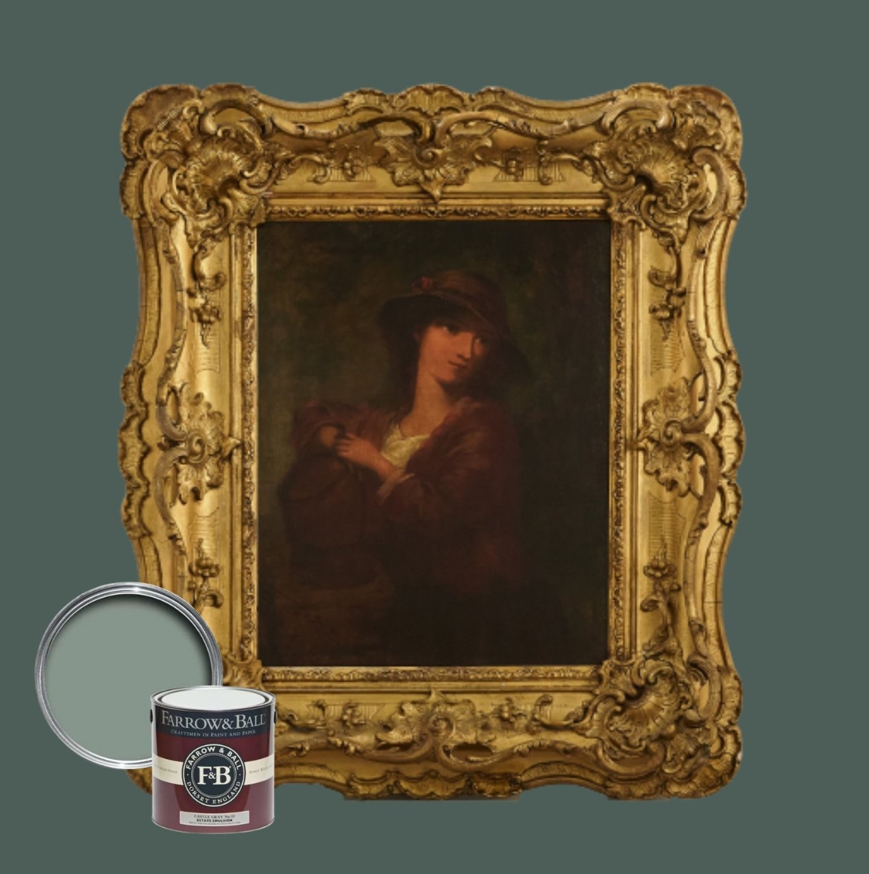
A show-stopping piece calls for Farrow & Balls’ ‘Castle Grey’. The fine gilt composition frame with swept edges, pierced details and ornate shell corner mouldings looks absolutely stunning set against this regency blue. We absolutely love it!